Wedding Invitations
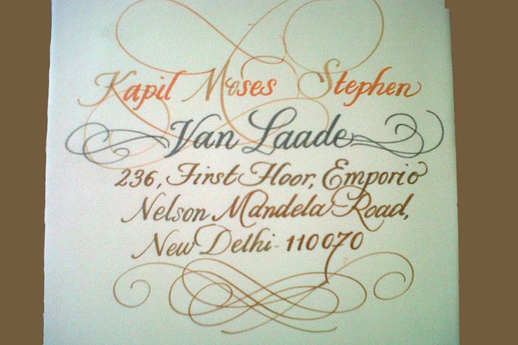
The brief: A Delhi family commissioned a suite of eighty wedding invitations for a north-Indian ceremony where the bride’s family traced its lineage through Persian-script poetry and the groom’s family was rooted in Sanskrit ritual. The deadline was twelve weeks; the constraint was that no two scripts could feel louder than another on the page.
Project context
The wedding sat at a meeting of two literary traditions. The bride’s grandfather had been a small-press publisher in old Lucknow whose ghazal collections were set in Urdu nastaliq. The groom’s family marked every household occasion with Sanskrit shlokas hand-copied in Devanagari Lipi. The couple wanted a single invitation that honoured both inheritances without forcing one to translate the other. Print and laser-cut foil felt too uniform for the texture they had in mind. Hand calligraphy let each script keep its own breath — the slow vertical drop of a nastaliq line and the squared rhythm of Devanagari sitting on the same paper without competing.
Materials and craft choices
- Paper: Sanganer handmade cotton rag, 180 gsm, deckled on all four edges
- Ink: walnut ink for the English copperplate names, sumi black for the Devanagari shlokas, iron-gall for the Urdu couplet
- Nib: Brause Rose for the copperplate, qalam (reed pen) cut at a 30-degree angle for the nastaliq, kept straight for the Devanagari
- Script: Multi-script suite — English Copperplate, Devanagari Lipi, Urdu Nastaliq
- Embellishment: 22-carat gold-leaf gilding on the central monogram; wax-sealed envelopes in oxblood; hand-bound silk cord in undyed tussar
Process
The first studio conversation lasted nearly three hours. We asked the families to send us the actual books they wanted referenced — the ghazal volume from Lucknow and a handwritten Sanskrit prayer book — so the proportions of the new piece could grow out of those sources rather than from a generic “Indian wedding” template. Across three review rounds, we drafted thirty different layouts on cartridge paper and tested ink behaviour at studio humidity. We tested the walnut ink at fifty per cent humidity in the May Delhi air, and it dried noticeably faster than in winter, so we adjusted the dilution by eight per cent for the production run. The final invitation reads top-to-bottom: copperplate names of the couple, a Devanagari shloka, then a single nastaliq couplet across the lower third, with the gilded monogram lifting all three together.
“Three scripts on one page is not three layers of design — it is one piece of paper learning to listen to itself.”
What we learned
The biggest lesson was rhythm. Nastaliq sits on a sloping baseline; Devanagari sits on a strict horizontal; copperplate floats. If you try to balance them on the same axis they fight. We solved it by treating each script as a separate musical bar — same time signature, different instrument — so the eye moved across the page without snagging. We also learned to reserve the gold for one mark only. Gilding three blocks would have flattened the hierarchy; restricting it to the monogram let the inks breathe and gave the eye a clear point of return. For any future multi-script wedding suite we will stage the scripts top-to-bottom rather than side-by-side, because vertical stacking respects each tradition’s natural reading direction.
Script: Multi-script Suite · Category: Wedding Services · Year: 2025
Have a project that needs hand calligraphy at this depth? Send us a brief or WhatsApp +91 98111 77262.
About this collection
Wedding invitations designed at Likhawat — concept, calligraphy, production, hand-addressing and dispatch. We work in nine languages and across modern, traditional and bilingual layouts. Have a date in mind? WhatsApp +91 98111 77262 with the wedding date and approximate guest count and we’ll come back with a quote.
May 9, 2026