Water-Colour Artworks
The brief: A small Delhi gallery commissioned a series of six A3 watercolour-and-brush-lettering panels for a group show on monsoon poetry. The constraint: no panel could repeat the same colour palette, but all six had to read as siblings on a single wall.
Project context
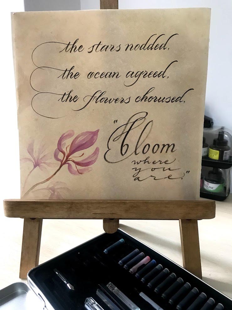
The exhibition was a ten-day pop-up tied to monsoon-themed poetry by living Indian poets writing in English. The gallery wanted artwork that sat between calligraphy and painting — words readable enough to be poems, washes loose enough to feel weather. Brush lettering was the natural fit. Pointed-pen scripts would have felt too tight against watercolour bleed; full painting without any letterform would have buried the poetry. Our role was to keep the words porous to the colour around them. Each of the six panels carried a single line from a different poet, with the wash colour drawn from the imagery of that line — petrichor brown, peacock teal, jamun violet, dust pink, monsoon grey, neem green.
Materials and craft choices
- Paper: Italian Fabriano Artistico 300 gsm cold-pressed, stretched on a board the night before to prevent cockling
- Paint: Daniel Smith and Sennelier watercolours mixed by hand for each panel; no two panels shared a finished palette
- Lettering tool: Pentel Pocket brush pen for the body of the lettering, supported by a Tombow Fudenosuke for the finer flourishes
- Script: Brush Lettering
- Embellishment: a single graphite serial number along the bottom edge — no signature, no gilding, no border
Process
For each panel we laid the wash first and the lettering second, which is the harder order. Most brush-lettering work runs the other way — letterforms first, watercolour around them — because that protects the pen strokes from bleed. Reversing the order meant we had to wait until the wash was dry to about eighty per cent humidity, then lay the brush stroke on a surface that was still soft enough to drink ink without resisting. The petrichor-brown panel was the hardest; sepia-toned washes turn muddy fast, and the brush stroke had to sit clean on top without picking up colour. We rehearsed each line on three sheets of practice paper in the morning, painted the wash by midday, and lettered in the late afternoon when the studio cooled and the wash had reached the right tooth.
“Brush lettering on a wet wash is not painting twice — it is letting two materials negotiate the page in front of you.”
What we learned
The lesson from the series was about restraint. Brush lettering rewards confidence — long unbroken strokes — but watercolour rewards waiting. Holding both habits at once meant slowing the lettering down by roughly twenty per cent and accepting one or two small irregularities per panel as part of the work, not flaws to fix. We also learned to mix more wash than we thought we needed; running out of a unique mid-panel colour and trying to remix it from memory cost us a full sheet on the first attempt. For the next monsoon-poetry brief, we will pre-mix all six palettes in jars before any brush touches paper.
Script: Brush Lettering · Category: Art Work · Year: 2025
Have a project that needs hand calligraphy at this depth? Send us a brief or WhatsApp +91 98111 77262.
About this collection
Water-colour artworks at Likhawat: hand-lettered verses set into washed colour, on archival paper. Each piece is one-of-one. Ideal for studies, drawing rooms and gifts.
May 9, 2026