Devanagari Calligraphy: The Forgotten Modern Script
Walk into any well-curated calligraphy exhibition in the subcontinent and you will see a quiet imbalance. The Persian-Arabic scripts — nastaliq, naskh, thuluth, diwani — dominate the walls. The Roman scripts — copperplate, Spencerian, italic — cover the rest. Devanagari, the script half a billion of us read every day, occupies a small corner. This is strange. It is also, slowly, beginning to change.
A short structural appreciation
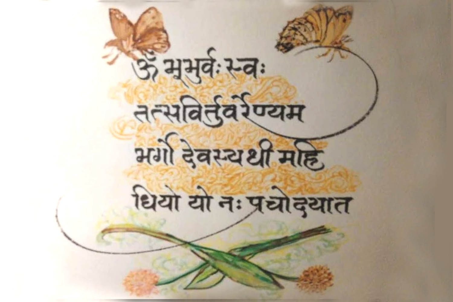
Devanagari is, formally speaking, an extraordinarily disciplined script. The shirorekha — the horizontal headline that ties consonants together — is a structural commitment few alphabets make. It declares that words are units, not loose collections of letters; that the line of writing is a horizon, not just a baseline. The matras — the vowel marks — sit above, below, before and after the consonant, turning each akshara into a small composition in itself.
For a calligrapher, this is generous architecture. You have a strong horizontal anchor (the shirorekha), vertical pillars (consonants like प, फ, प्र), and curved counters (ग, म, व) that ask for a confident sweep. The flat-edged pen handles all of these naturally because Devanagari grew up alongside the reed pen of the Gupta period.
Where it came from
The lineage runs Brahmi (3rd century BCE) → Gupta script (4th-6th century CE) → early Nagari (7th-10th century) → mature Devanagari (around the 11th century). Each step softened the angularity inherited from chiselled stone inscriptions and took on the rhythms of a wet pen on bark, palm-leaf and (later) paper. The shirorekha, surprisingly, is not original. Early Brahmi had no headline; it accreted gradually as scribes began joining the tops of letters for visual rhythm. By the time Devanagari stabilised, the headline had become inseparable from the script’s identity.
Devanagari, the script half a billion of us read every day, occupies a small corner of most calligraphy exhibitions. This is strange.
Why so few modern Indian calligraphers work in it
Three forces, mostly. The first is colonial: the institutionalisation of English-medium art education in the 19th and 20th centuries quietly displaced indigenous lettering traditions. Calligraphy got coded as either Islamic (still taught in select madrasas and through the masters of Lucknow and Delhi) or Western (taught in design schools alongside graphic design). Devanagari fell between the two stools.
The second is commercial. Indian wedding stationery has, until recently, used Devanagari typeset, not hand-drawn. Couples who wanted hand calligraphy chose English copperplate (for the foreign-relative audience) or Urdu nastaliq (for the cultural register). Devanagari was — and this is a strange thing to write — considered too familiar to be ceremonial.
The third is technical. The flat-brush and the broad-edged pen are the natural tools for Devanagari, but most Indian calligraphy supplies are pointed-nib oriented (because that is what English copperplate needs). Sourcing a good 5 mm Brause Bandzug or a Pilot Parallel in India is harder than sourcing a Brause Rose. The infrastructure has lagged the appetite.
Two styling traditions: pen-and-ink vs flat-brush
Within Devanagari calligraphy, two distinct lineages have emerged in the past forty years.
Pen-and-ink Devanagari uses a broad-edged metal nib (typically 3-5 mm) loaded with sumi or walnut ink. The strokes are crisp, the contrast between thick and thin is sharp, and the shirorekha is a single confident horizontal pull. This style works beautifully for ceremonial single-line compositions — mantras, verses, monograms.
Flat-brush Devanagari uses a flat sable or hog-bristle brush, often loaded with diluted gouache, on absorbent paper. The line is softer, the edges feather, and the script feels more painted than written. This is the tradition in which Achyut Palav has done most of his celebrated experimental work — large-format compositions where Devanagari becomes nearly abstract while remaining legible.
The contemporary moment
Two institutions deserve mention. Achyut Palav School of Calligraphy in Mumbai, run by the artist himself, has trained a generation of Devanagari calligraphers and pushed the script into editorial design, packaging and large-scale public art. Calligraphy Foundation of India, smaller and more academic in temperament, runs annual workshops and has been quietly archiving regional Devanagari sub-styles before they disappear with their last practitioners.
Outside these formal institutions, the bigger shift is happening on Instagram, oddly enough. Younger Indian calligraphers in Pune, Bangalore, Ahmedabad and Kolkata are posting Devanagari work weekly — ghazals from Faiz, dohas from Kabir, single-word compositions of grief and joy. The audience is enthusiastic. The skill base is widening. The script is, finally, getting back the visual respect it has always structurally deserved.
A small invitation
If you have ever been tempted to learn Devanagari calligraphy, this is the moment. The pen-and-ink lineage is teachable in eight to ten weeks of disciplined practice. The flat-brush lineage takes longer but rewards patience extravagantly. Either way, the script gives back more than it asks for — and the small corner it currently occupies in our exhibitions will not stay small for much longer.